Theming & Editing the UI
The garage UI is designed to be yours. There are two layers of customization, from quick to deep:
- Swap the Theme asset - one file recolors and refonts the entire garage. No prefab editing.
- Edit the canvas prefab - the UI is a real, hand-editable uGUI hierarchy. Move panels, resize cards, delete what you do not want.
This chapter covers both, plus the mobile/responsive system.
Layer 1: The Theme Asset
An RCCPT_Theme asset holds every color, font, and sprite the garage uses. The shipped default is Resources/RCCPT_Theme_Default: a near-black panel set with a white accent, warm orange price text (#FFB066) and a thin orange panel border at 25% alpha. Create your own with Assets > Create > BoneCracker Games > RCCP Tuner > Theme and assign it either project-wide (RCCPT_Settings.theme) or per scene (the controller's Theme Override).
The controller's Setup Health block prints which theme the scene actually resolves to, and whether it came from the scene override or the project default. That is the fastest answer to "why is my theme not applying" - see Editor Tools.
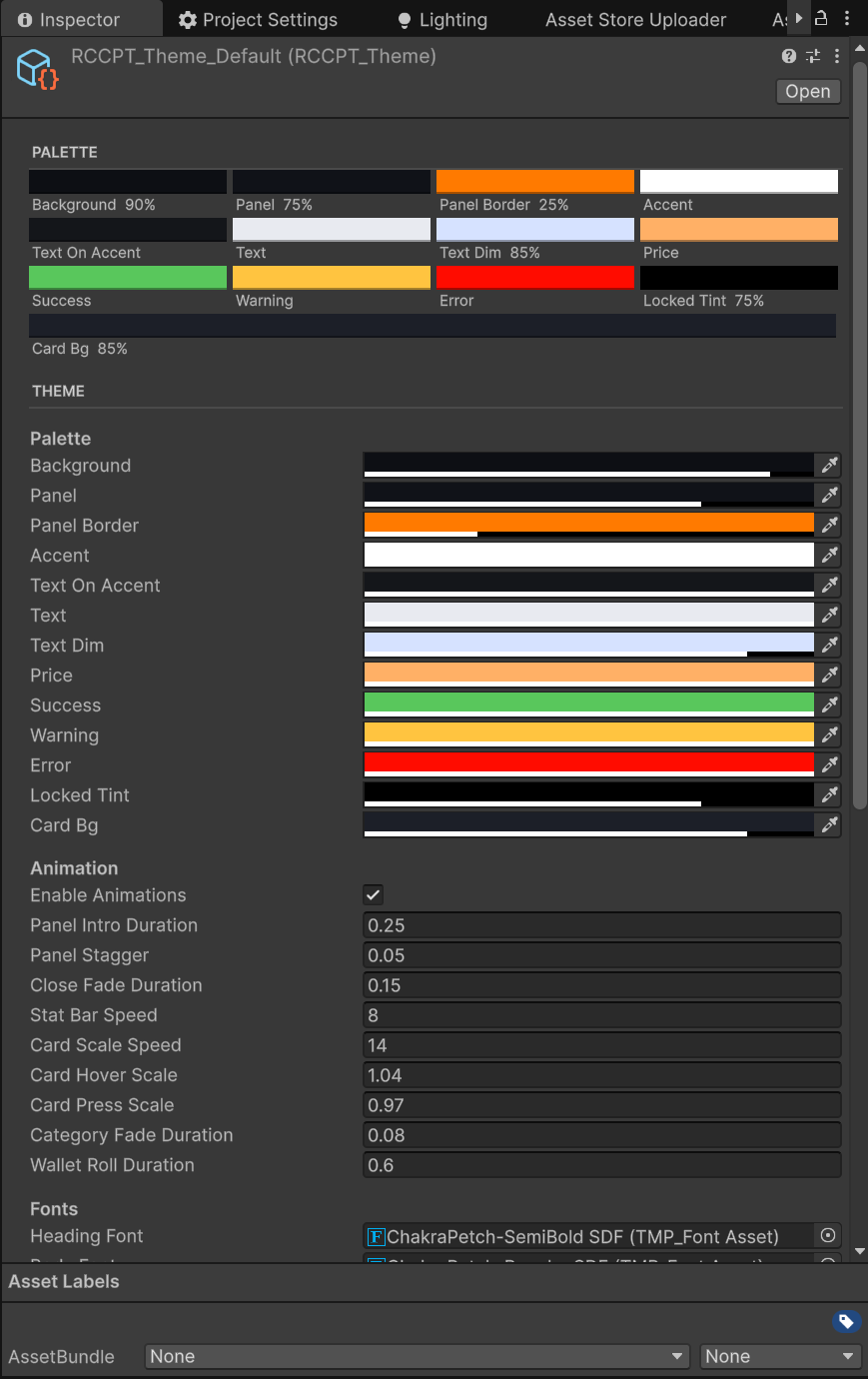
Scroll further down the same inspector for the sprite slots and the per-category icon array described later in this chapter.
Palette
The theme inspector draws these as a swatch grid, four per row, each labelled with its name and alpha, so you can read the palette without clicking into every field (Editor Tools).
Not every slot is wired into the shipped canvas. A color reaches the screen in one of two ways: through an RCCPT_ThemeBinder component carrying the matching role (see Theme Binders below), or because a script reads the field directly. The last column tells you which - and where a slot is dead, it says so rather than letting you chase an edit that changes nothing.
| Setting | Styles | Reaches the shipped canvas? |
|---|---|---|
| Background | Full-screen backdrop tint behind the whole garage overlay | No - no element carries the Background role |
| Panel | Fill color for the large HUD panels (top bar, rail, strip, drawer) | Yes - 9 PanelBg binders |
| Panel Border | Thin border color on panels | No - no element carries the Border role |
| Accent | Primary brand color - buttons, highlights, selection outlines | Yes - 16 AccentButton binders, plus the active rail tab, in-cart card tint, preview tint and active selector buttons in code |
| Text On Accent | Text drawn on top of accent-colored elements (checkout button etc.) | Yes - 7 TextOnAccent binders |
| Text | Primary text color | Yes - 5 HeadingText + 11 BodyText binders |
| Text Dim | Secondary / dimmed text (descriptions, hints) | Yes - 23 DimText binders |
| Price | Price tag text color | Yes - 10 PriceText binders, plus item card prices in code |
| Success | Positive feedback (owned, purchase success) | Yes, but code only - OWNED / EQUIPPED price lines, the equipped card tint, the cart's REMAINING line |
| Warning | Cautionary feedback | No - nothing in the Tuner reads this field |
| Error | Denied feedback (failed purchase, unaffordable prices) | Yes, but code only - unaffordable price text, the cart's MISSING line |
| Locked Tint | Dark overlay tint for a LockOverlay element |
No - no element carries the LockOverlay role |
| Card Bg | Item card background fill | Yes - 24 CardBg binders, plus inactive selector buttons in code |
⚠ Four of the thirteen slots do nothing in the shipped canvas. Background, Panel Border and Locked Tint are wired to binder roles that the shipped hierarchy never uses, and Warning has no consumer at all - no role, no script. Editing any of them changes nothing on screen. They are kept because they still work for UI you add: drop an
RCCPT_ThemeBinderset toBackground,BorderorLockOverlayon your own Image and the matching color starts driving it. Warning is a spare color you can read from your own scripts.⚠ "Locked Tint" does not dim the can't-afford cards. That dimming is hardcoded:
RCCPT_ItemCardlazily adds aCanvasGroupto the card and drops its alpha to 0.55 for the unaffordable state (the card stays clickable - staging an item you cannot yet afford is allowed). To change how a can't-afford card looks, edit that alpha inRCCPT_ItemCard, not the theme.
The fastest way to re-brand: change Accent (and Text On Accent to keep button labels readable). The shipped default leaves the accent white, so that one field is what turns the garage into your brand.
The UI's Color Language
Beyond the raw palette slots, the garage speaks a consistent semantic color language. Preserve these meanings when re-theming - players read state from them at a glance. If you have not played the garage yet, Using the Garage shows every one of these states in context, including a diagram of the five item-card states:
| Meaning | Palette slot | Where you see it |
|---|---|---|
| Purchasable (price) | Price | Item card price tags, cart line prices, TOTAL |
| Can't afford | Error | Red prices, dimmed cards, the cart's MISSING line, disabled CHECKOUT |
| Owned / equipped | Success | OWNED / EQUIPPED card lines, the cart's REMAINING line. The equipped badge stays vivid; a merely-owned badge is faded |
| Staged in cart | Accent | Card background tint, the IN CART badge, the cart count on the top bar |
| Active selection / preview | Accent + button sprite | Paint COLORS / CUSTOM / FINISH modes, decal placements, the PREVIEW chip |
| Hints / secondary | Text Dim | Descriptions, hint lines, the tuning RESET button |
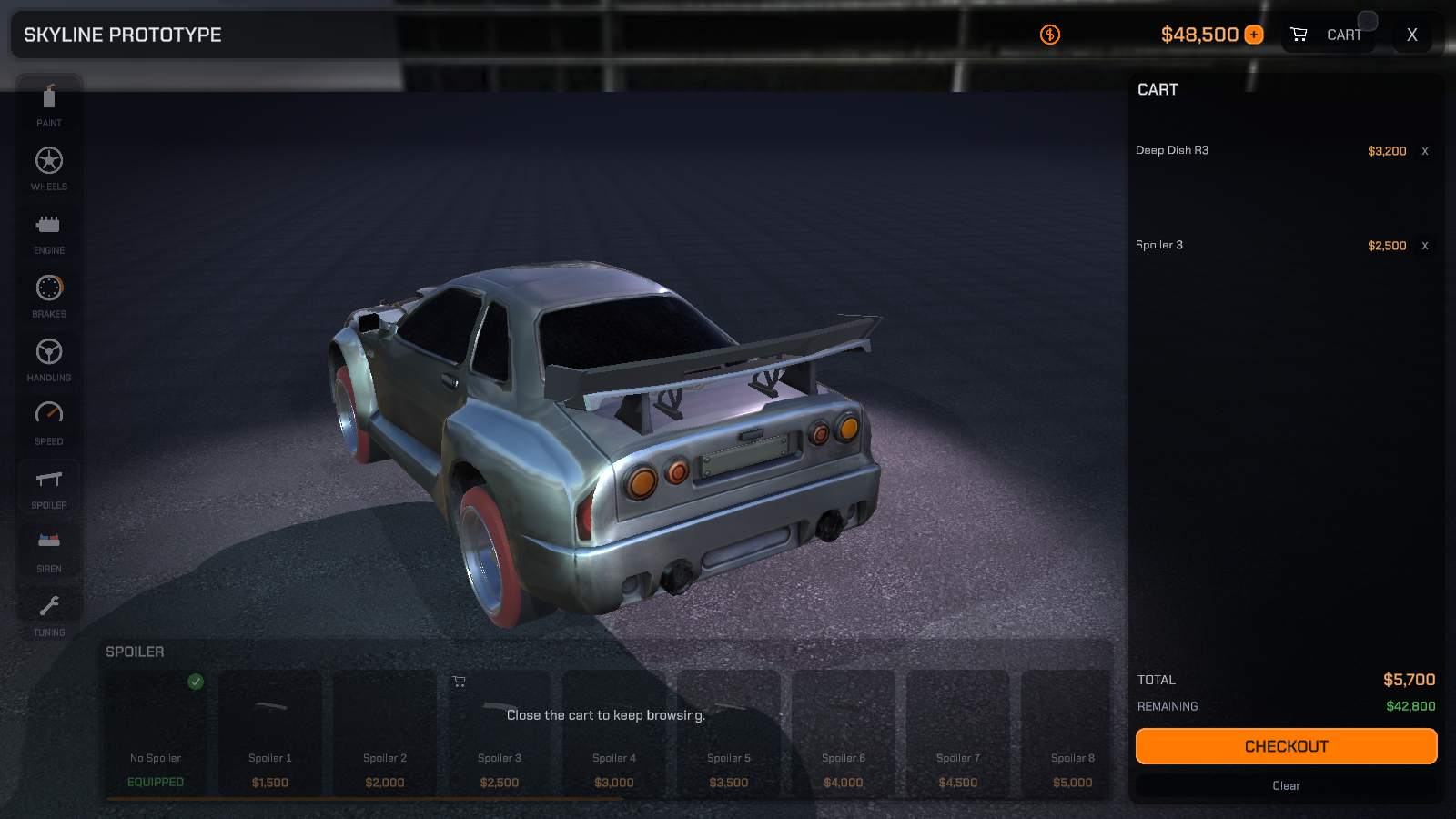
Note what the picture also shows about the other dimming rule: while the cart is open, the whole item strip fades and stops responding. That is the modal lock, not the can't-afford state - both use a dim, so read the price colour to tell them apart. The five card states are shown side by side in Using the Garage.
One rule worth keeping: accent-colored surfaces should use the button sprite, not the card sprite. The shipped card texture is dark, and tinting it with a bright accent multiplies into a muddy tone that swallows Text On Accent labels - the built-in selectors already swap sprites for exactly this reason.
Animation
The theme also owns the motion feel. Enable Animations (default on) is the master switch - off reproduces instant snap behavior everywhere, which some UI styles (and accessibility preferences) want.
| Setting | Default | Controls |
|---|---|---|
| Panel Intro Duration | 0.25 | Per-panel open fade/slide (seconds, unscaled) |
| Panel Stagger | 0.05 | Delay step between panels in the open stagger |
| Close Fade Duration | 0.15 | Whole-canvas close fade |
| Stat Bar Speed | 8 | Stat bar fill smoothing (higher = snappier) |
| Card Scale Speed | 14 | Item card hover/press scale smoothing |
| Card Hover Scale | 1.04 | Card scale while hovered |
| Card Press Scale | 0.97 | Card scale while pressed |
| Category Fade Duration | 0.08 | Item strip cross-fade on category switch |
| Wallet Roll Duration | 0.6 | Rolling balance count-up/down duration |
Fonts
Heading Font (headings, prices, buttons) and Body Font (descriptions). The shipped theme uses Chakra Petch - ChakraPetch-SemiBold SDF for headings and ChakraPetch-Regular SDF for body (SIL Open Font License; the license text ships in Fonts/OFL.txt, so distributing it with your game is fine). Assign any TMP font assets of your own. A binder only assigns a font when the slot is filled, so an empty slot simply leaves whatever font the text object already has.
Sprites
Three of the sprite slots are 9-slice sprites - a sprite with border values set in Unity's Sprite Editor, so its corners stay crisp when the element is stretched to any size. If you assign a sprite with no borders the binder draws it unstretched instead (Image.Type.Simple), which is why a hand-made panel background can come out looking squashed with no error in the Console.
| Slot | Used by | Notes |
|---|---|---|
| Panel Sprite | The PanelBg role (top bar, rail, strip, drawer, tuning panel) |
Shipped: rccpt_panel |
| Card Sprite | The CardBg role (item cards, plain buttons, scrollbar track) |
Shipped: rccpt_card |
| Button Sprite | The AccentButton role (CHECKOUT, UNLOCK TUNING, the PREVIEW chip, active selector buttons) |
Shipped: rccpt_button |
| Lock Icon | Nothing | Dead slot - see below |
| Cart Icon | Nothing | Dead slot - see below |
| Owned Badge | Nothing | Dead slot - see below |
| Category Icons | The category rail, and the auto-generated level cards in the upgrade categories | 11 entries, indexed by category |
The shipped sprites live in Textures/UI/.
⚠ The lock / cart / owned-badge slots are never read. No script and no binder role pulls them, and the shipped canvas bakes
rccpt_lock,rccpt_cartandrccpt_ownedstraight onto the Images that show them (the tuning panel'sLockIcon, the top bar's cartIconand the in-cart badge, the card'sOwnedBadge). Assigning your own sprites into these three theme slots changes nothing on screen - swap them on those Image components instead, exactly as you would the card sprite.⚠ An empty sprite slot does not give you a flat color fill. A binder overwrites an element's sprite only when the theme slot is non-empty (
if (applySprite && sprite != null)). Every panel, card and button in the shipped canvas already has its sprite baked in, so clearing Panel Sprite on a theme leaves the shipped 9-slice exactly where it was and only the color changes. You get a flat color fill only on an Image you authored yourself with no sprite of its own.
Category Icons is an 11-element array indexed by the RCCPT_Category enum, in this order: Paint, Wheels, Engine, Brake, Handling, Speed, Spoiler, Siren, Decal, Neon, Tuning. You do not have to count positions - the theme inspector labels every slot with its category name, and warns with a one-click Resize To 11 fix if the array length has drifted so that some categories can never resolve an icon.
Reordering the Category Rail
The rail order is not part of the theme and is not hardcoded: it is the Category Order list on RCCPT_Settings (project-wide). The rail draws the categories in exactly that order, and the garage opens on the first one the vehicle actually supports.
- Reorder the list to change the tab order - put Wheels first, for example.
- Delete an entry to remove that category from the rail for every vehicle in the project.
- Categories the vehicle cannot support (no spoilers on the model, no neon in the Built-in pipeline) hide themselves per vehicle whether or not they are listed - see Troubleshooting.
The settings inspector validates the list for you: it names any category you left out ("these categories never appear in the rail") or listed twice, and offers a Rebuild Order button that keeps your order, drops the repeats and appends whatever is missing. See Editor Tools.
Applying a Theme
- Runtime: automatic - every binder styles itself when it is enabled, and the canvas re-applies the resolved theme to all of its binders when the garage opens.
- Editor: click Apply Theme To Scene Canvases at the bottom of the theme's inspector to restyle the open scene immediately (undo-able).
How Theming Works: Theme Binders
Every themed element on the canvas carries a small RCCPT_ThemeBinder component that says which role it plays. Applying a theme walks all binders and styles each element from the matching theme slot - the hierarchy itself is never rebuilt, which is why your structural edits survive re-theming. The shipped canvas holds 105 of them.
There are 13 roles. A binder styles the Image or the TMP text on its own GameObject, whichever it finds:
| Binder role | Applies to | Pulls from the theme | Used in the shipped canvas |
|---|---|---|---|
| PanelBg | Image | Panel color + Panel Sprite | 9 |
| CardBg | Image | Card Bg color + Card Sprite | 24 |
| AccentButton | Image | Accent color + Button Sprite | 16 |
| HeadingText | TMP text | Text color + Heading Font | 5 |
| BodyText | TMP text | Text color + Body Font | 11 |
| DimText | TMP text | Text Dim color + Body Font | 23 |
| PriceText | TMP text | Price color + Heading Font | 10 |
| TextOnAccent | TMP text | Text On Accent color + Heading Font | 7 |
| SuccessText | TMP text | Success color + Body Font | none |
| ErrorText | TMP text | Error color + Body Font | none |
| LockOverlay | Image | Locked Tint color (no sprite) | none |
| Border | Image | Panel Border color (no sprite) | none |
| Background | Image | Background color (no sprite) | none |
The last five roles are unused by the shipped hierarchy - that is the mechanical reason the Background, Panel Border and Locked Tint palette slots are inert, and it is also why they start working the moment you add a binder of your own with one of those roles.
Apply Sprite on the binder controls whether the role's sprite is assigned too, and only the three Image roles that carry a sprite (PanelBg, CardBg, AccentButton) are affected by it. In the shipped canvas it is on for panels and buttons, and off where an element keeps its own baked sprite - notably the item card template, whose card sprite you therefore swap directly on its Image, not through the theme.
Adding your own UI to the canvas? Drop an RCCPT_ThemeBinder on it, pick a role, and it re-themes with everything else.
Layer 2: Editing the Canvas Prefab
Prefabs/RCCPT_TunerCanvas.prefab is a deliberate design choice: a real authored hierarchy, not a UI that assembles itself at runtime. Open it in Prefab Mode and rearrange, resize, restyle, or delete like any uGUI canvas. This is the layout you are editing:
RCCPT_TunerCanvas              (Canvas + RCCPT_TunerUI + RCCPT_ResponsiveLayout)
  ContentRoot                  (everything below only shows while the garage is open)
    ViewportDrag               invisible full-screen catcher: drag = orbit, scroll/pinch = zoom
    Vignette                   decorative edge darkening (never blocks clicks)
    SafeAreaRoot               mapped to the device safe area
      TopBar                   VehicleName, WalletGroup, CartButton, ExitButton
      CategoryRail             ButtonContainer > ButtonTemplate (cloned per category)
      StatPanel                the four stat bars (upgrade categories only)
      InfoPanel                hover description panel
      ItemStrip                the bottom strip
        Title
        DecalLocationRow       FRONT / BACK / LEFT / RIGHT selector buttons
        PreviewBadge           the PREVIEW chip - on only while a hover try-on is on the car
        Scroll
          Viewport
            CardContainer
              CardTemplate     cloned per item (disabled in the prefab)
          HScrollbar           slim auto-hiding scrollbar for catalogs wider than the strip
        PaintModeRow           COLORS / CUSTOM / FINISH selector buttons
        CustomColorGroup       the custom paint picker (swatch, RGB rows, APPLY)
      TuningPanel
        LockedGroup            LockIcon, hint, UNLOCK TUNING button
        UnlockedGroup
          Scroll > Viewport > List
            SliderRowTemplate  Label, Slider, Value (cloned per tuning row)
            ColorRowTemplate   Label + Swatches (cloned per tuning color row)
          ResetButton          the RESET-to-stock button
      CartDrawer               the sliding cart
        Header
        Scroll
          Viewport
            RowContainer
              RowTemplate      Name, Price, Remove (cloned per cart line)
        EmptyLabel
        TotalLabel / TotalValue
        RemainingLabel / RemainingValue   the post-checkout balance line
        CheckoutButton / ClearButton / DiscardConfirmGroup
      Toast                    transient notifications
      LockHint                 "Close the cart to keep browsing." hint
  Audio                        garage music + UI SFX ([UI Audio & Music](09_audio.html))
Four of those children are easy to trip over while restyling:
ItemStrip > PreviewBadgeis the PREVIEW chip. It sits at the top-right of the strip and is disabled in the prefab; the strip enables it only while a hover try-on is being worn by the car.ItemStrip > Scroll > HScrollbaris set to Auto Hide, so it is invisible until a catalog is wider than the strip. If you shrink the strip's height, give it room or the last few pixels of the cards get covered.TuningPanel > UnlockedGroup > ResetButtonis the RESET-to-stock button, anchored to the top-right of the unlocked group above the slider list. Its label is aDimTextbinder, so it follows Text Dim, not Accent - deliberate, because it is a secondary action next to a category the player paid to unlock.CartDrawer > RemainingLabel/RemainingValueare the balance line between TOTAL and CHECKOUT. The drawer flips them between REMAINING (value in Success, label in Text Dim) when the cart fits the wallet and MISSING (both in Error) when it overshoots, and hides them entirely when the cart is empty or the economy is off. They cost the drawer vertical space - if you re-lay-out the cart, keep a band for them or delete both and accept the feature going quiet.
Three ground rules keep edits safe:
- Move and restyle freely; be careful deleting. Each panel component (
RCCPT_TopBar,RCCPT_ItemStrip...) holds wired references to its own children (a price label, a button...). Deleting a wired child disables that piece of functionality - the components null-check everything, so nothing crashes, but the feature silently stops. Deleting whole optional panels you do not want (for exampleStatPanel) is fine. - Templates are cloned at runtime. Objects named
...Template(the item card, cart row, category button, tuning slider row) sit disabled in the prefab and are instantiated per item, then refreshed in place. Edit the template and every clone inherits the change. - Colors and fonts belong to the theme. You can hard-edit an Image's color in the prefab, but the next theme apply overwrites it (that is the binder's job). To change colors, change the theme - or remove the element's
RCCPT_ThemeBinderif you want it out of the theming system entirely.
Recipe: Restyle the Item Cards
The item card template lives at ItemStrip > Scroll > Viewport > CardContainer > CardTemplate (disabled). Its children: PreviewOutline, Swatch (paint color fill), Icon, Name, Price, OwnedBadge, InCartBadge.
- Open the canvas prefab in Prefab Mode and select
CardTemplate. - Want bigger cards? Change the
LayoutElement.preferredWidth(default 118) and the template's height comes from the strip. - Rearrange the name/price/badges like any RectTransforms; adjust font sizes on the TMP components.
- The card background color comes from the theme (
Card Bg). The card sprite is baked into the template (its binder deliberately keeps its own sprite) - to change the card shape, swap the sprite onCardTemplate's Image component directly. - Save the prefab - every card in every category now uses your layout.
Two things on the card are driven at runtime and will quietly override an edit:
- The
Nametext has TMP auto-sizing on, between 8 and 12, so long item names shrink instead of clipping mid-word. Setting a plain font size on it does nothing; changeFont Size Min/Font Size Maxinstead. RCCPT_ItemCardadds aCanvasGroupto the card at runtime and drives its alpha (0.55 while unaffordable, 1 otherwise). Do not put your ownCanvasGrouponCardTemplatefor a fade effect - the card will fight you for it.
The cart rows work identically: CartDrawer > Scroll > Viewport > RowContainer > RowTemplate (children Name, Price, Remove).
Mobile & Responsive Layout
The RCCPT_ResponsiveLayout component on the canvas root handles small screens with zero setup:
- Safe area:
SafeAreaRootis remapped toScreen.safeAreaevery time the screen size changes - notches and rounded corners never clip the UI. - Compact layout: at aspect ratios at or below
Compact Aspect Threshold(default 1.15, i.e. portrait-ish), managed panels swap from their wide anchor preset to a compact one: the category rail becomes a bottom tab bar, the item strip stretches full-width, and the cart drawer opens as a full-screen sheet.
The wide/compact anchor presets live in the component's Managed Rects list. Five panels are managed: CategoryRail, ItemStrip, CartDrawer, InfoPanel and StatPanel. TopBar is deliberately not in the list - it stretches across the top in both layouts, so it needs no second preset.
Each entry stores a target RectTransform plus eight raw Vector2 fields: wideAnchorMin/Max, wideOffsetMin/Max and the same four again for compact. There is no capture button, so author them by hand:
- Set the Game View to a wide aspect (16:9) and lay the panel out where you want it in Prefab Mode or in the scene.
- Copy that RectTransform's Anchors and the Left/Bottom and Right/Top offsets into the entry's four
wide*fields. - Set the Game View to a portrait aspect at or below the threshold (9:16 for example) so the compact layout is what you are looking at.
- Lay the panel out again for that shape and copy the result into the four
compact*fields. - Verify in Play Mode.
RCCPT_ResponsiveLayoutapplies a preset when it is enabled and again whenever the screen size changes, so switching the Game View aspect while playing swaps the layout live. It does not run in Edit Mode, so nothing moves until you press Play.
If you add a panel of your own and want it to move on phones, add a
Managed Rectsentry for it. A panel with no entry simply keeps its authored anchors in both layouts, which is fine for anything already anchored sensibly.
Renaming the UI Text
Every fixed label lives in one static class, RCCPT_Strings, designed as the localization seam - swap the strings at startup from code. That includes the short state words this chapter keeps naming: PreviewBadge ("PREVIEW"), TuningReset ("RESET"), CartRemaining ("REMAINING") and CartMissing ("MISSING"), alongside "CART", "CHECKOUT", the category names and the confirm dialogs. Item names come from your catalogs, never from there. See Scripting API.
Next Steps
- The camera is themable too - in its own way: The Cinematic Camera.
- Swap the sounds: UI Audio & Music.
- Every inspector referenced above, in one place: Editor Tools.